
Affinity Diagrams
| Number of Participants | Facilitators | Category | Duration | Level of Difficulty |
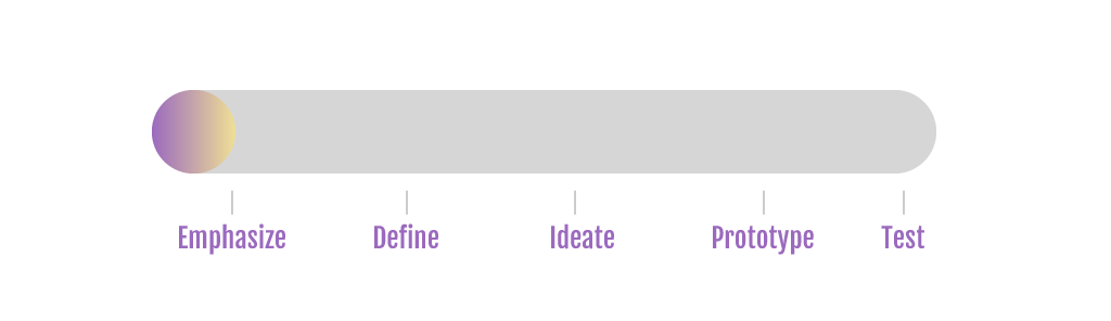
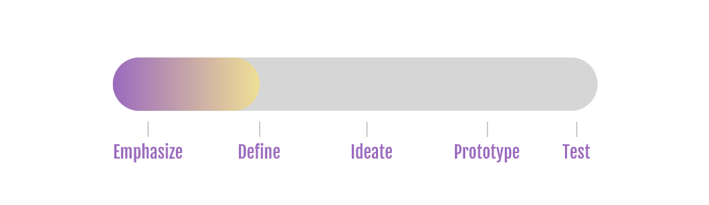
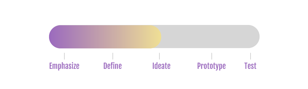
| 2-6 | 1 | Empathize, Define, Ideate | 90min | Simple |
Description
The term “Affinity Diagram” was devised by Jiro Kawakita in the 1960s. It is also called the “KJ Method”.
Affinity Diagrams are a way to organize complex data or data that one is not able to make sense of, into groups or categories based on their relationships or characteristics. Once categorised into different groups and placed in a hierarchical structure, the data is organized and more understandable in order to further analyze it, draw conclusions and determine next steps. This method can be used at any stage in the design process where large information is collected. For e.g. Brainstorming sessions (data generated within a session), Data collected from interviews, surveys, etc.
Materials
- Sticky Notes
- Pens
- Large Flat surface like a Table, wall or a blackboard
- If in person interaction is not feasible, an online software tool eg. Miro
Preparation
Form a team. Keep the team size to 6 participants or less. Involve people from diverse areas like customer facing roles, internal/external stakeholders etc.
Choose a facilitator. The facilitator will communicate the agenda and the objective to the participants and describe how each phase of this method works in addition to assist the team to be on track and focussed through the exercise.
Step-by-Step Instructions
- The facilitator explains the problem statement to the team.
- Generation/Collection of ideas: The participants in the team get to together to generate ideas for the given Problem Statement or collect all the information and ideas gathered from other techniques like interviews and surveys.
- These ideas are listed down separately on sticky notes by all the participants.
- There should be no limit to the number of ideas each participant can generate.
- Display of ideas: All the sticky notes are placed on a flat surface like a wall, table or a blackboard.
- Grouping of ideas: The ideas are categorised into groups based on similarities or characteristics shared with each other e.g. Start with one sticky note and place it aside. Then, pick another and check if it’s related to the one kept aside earlier. If yes, then place it with the earlier one and this forms the beginning of a group. If the second is not related to the one kept aside, place it separately (basically the beginning of a new group). Similarly, pick all the sticky notes one by one and based on their characteristics or themes, place them in appropriate groups. If a particular sticky note cannot be placed in any group, leave it alone and it shall form a separate group in itself.
- It is recommended that all participants work silently through the grouping process to avoid bias and influence.
- Naming the groups: Choose a relevant header above each group that best describes it on basis of the characteristics of the group. Use a different colored sticky note for the Headers. If there are groups that are related to each other, then you can create a superheader that combines those groups forming hierarchies.
- This hierarchical structure of groups formed is your Affinity Diagram.
- In the end, you can ask the participants to vote for groups as per their criticality to prioritize them. This helps in selecting only preferred ideas to be carried forward in the design phase and maintain focus on important features.
- Once all your data is organised and structured in a meaningful way, you can focus on the pain points, user needs, insights or look for gaps that need to be addressed
Remarks, Tips, Limitations
- Simple and easy to use
- Presents easy to view Big Picture
- For fewer than 15 data points, creating an affinity diagram may not be necessary
- While grouping, do not overthink and follow your gut instinct
- Affinity Diagrams work best when participants are limited to 5 or 6
- At times, it gets difficult to find similarities in ideas
- You can also use online tools like Miro to create Affinity Diagrams that can be saved and shared
- The process can be time consuming
References
Savina, A.(2019).How to create affinity diagrams to organize and cluster your ideas.[Blog] Miro. Available at: https://miro.com/blog/create-affinity-diagrams/ (Accessed: 20 Nov 2020)
pqsystems.com.(2020).Operational Definition. In: Graham, J.,Cleary, M.Practical Tools for Continuous Improvement Volume 2 Statistical Tools. Available at: https://www.pqsystems.com/qualityadvisor/DataAnalysisTools/affinity_diagram.php (Accessed: 19 Nov 2020)
Christensen, E.(2017).Affinity Diagrams: Your Key to More Creative Problem Solving.[Blog] LucidChart. Available at: https://www.lucidchart.com/blog/affinity-diagrams-your-key-to-more-creative-problem-solving (Accessed: 19 Nov 2020)
Pernice, K.(2018).Affinity Diagramming for Collaboratively Sorting UX Findings and Design Ideas.[Online]. Available at: https://www.nngroup.com/articles/affinity-diagram/ (Accessed: 19 Nov 2020)
Lucero, A.(2015).Using Affinity Diagrams to Evaluate Interactive Prototypes. In: Human-Computer Interaction. [online]. DOI: 10.1007/978-3-319-22668-2_19 (Accessed: 19 Nov 2020)
Weprin, M.(2016).Design Thinking Methods: Affinity Mapping.[Online]. Available at: https://uxdict.io/design-thinking-methods-affinity-diagrams-357bd8671ad4 (Accessed: 19 Nov 2020)
Contributed by Bhavana Malve.

